WORK
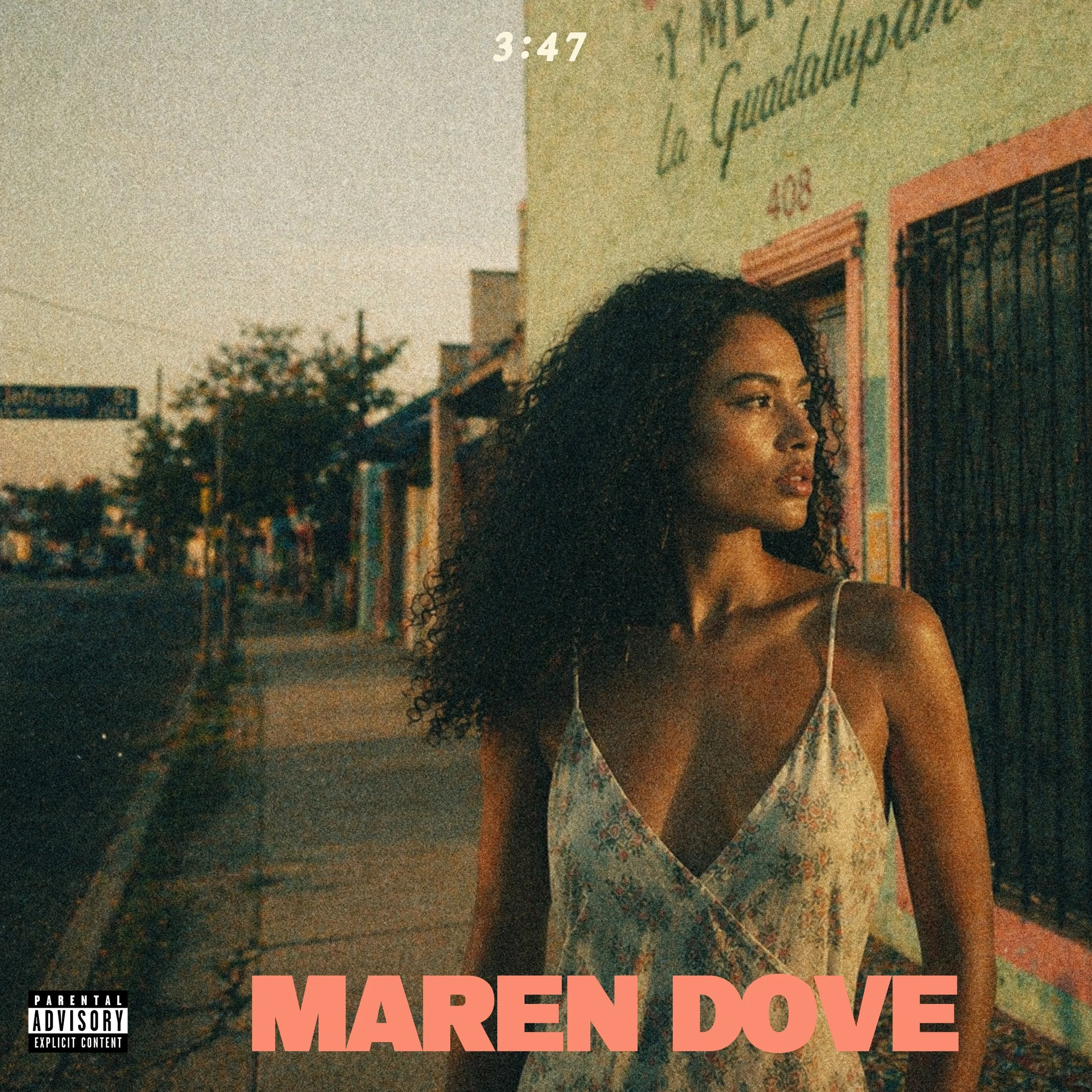
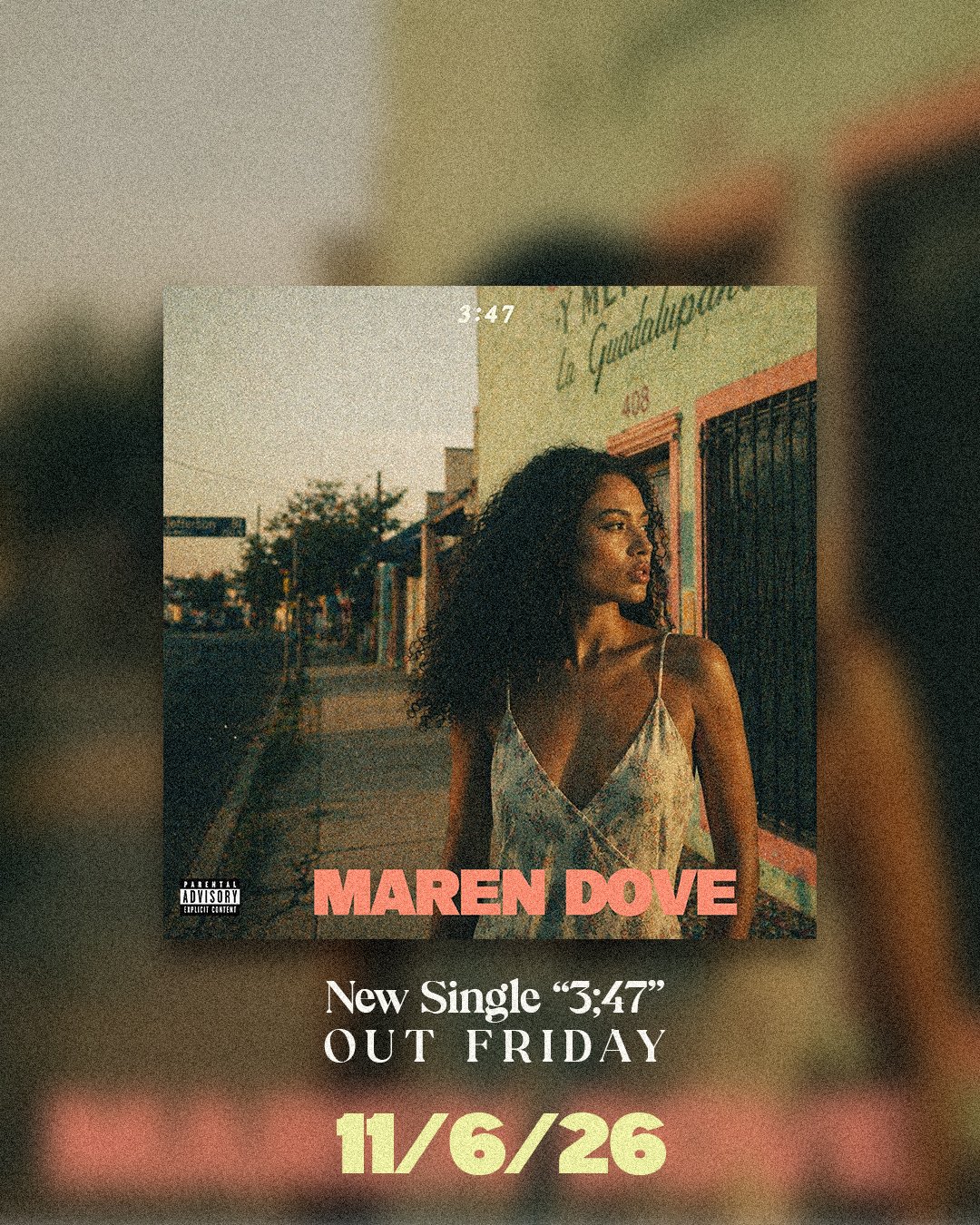
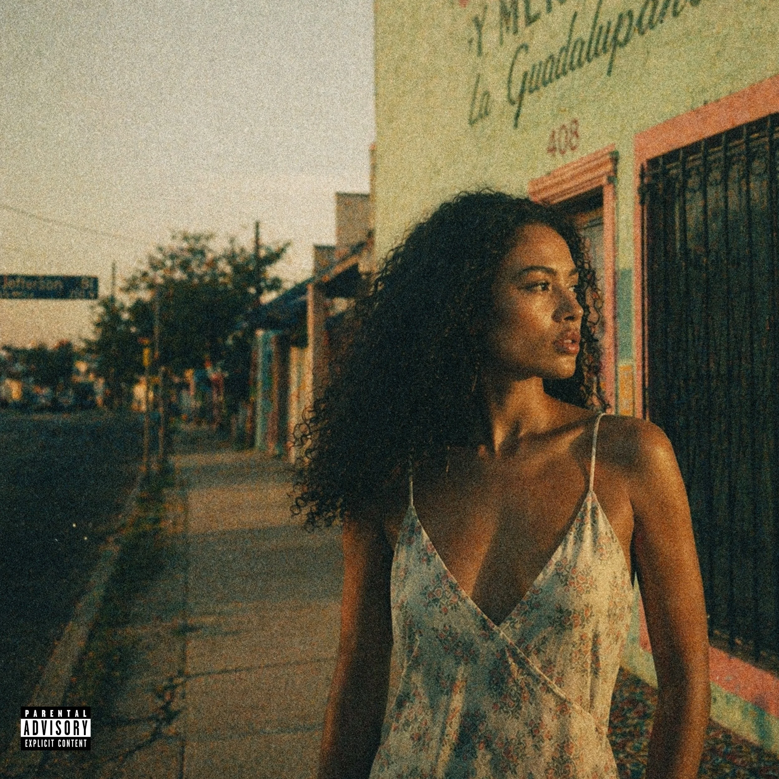
Maren Dove — “3:47”
Brief
A 24-year-old Oak Cliff artist needed a visual world for her debut single, “3:47,” a slow soul record shaped by church organ, chopped drums, Baptist choir texture, bedroom songwriting, and a chance encounter in the Bishop Arts District.
Direction
The release world centered on Oak Cliff at golden hour: stucco, chain-link, Texas Theatre, Lake Cliff Park, corner-store dusk, purple-amber light, film grain, and warm imperfection. A barely visible Polaroid detail of her grandmother’s gold bracelet became the emotional anchor. The goal was memory-heavy and local, vintage-leaning without becoming nostalgic for nostalgia’s sake.
Deliverables
Single cover direction, release-world brief, color palette, typography direction, visual references, social rollout guidance.
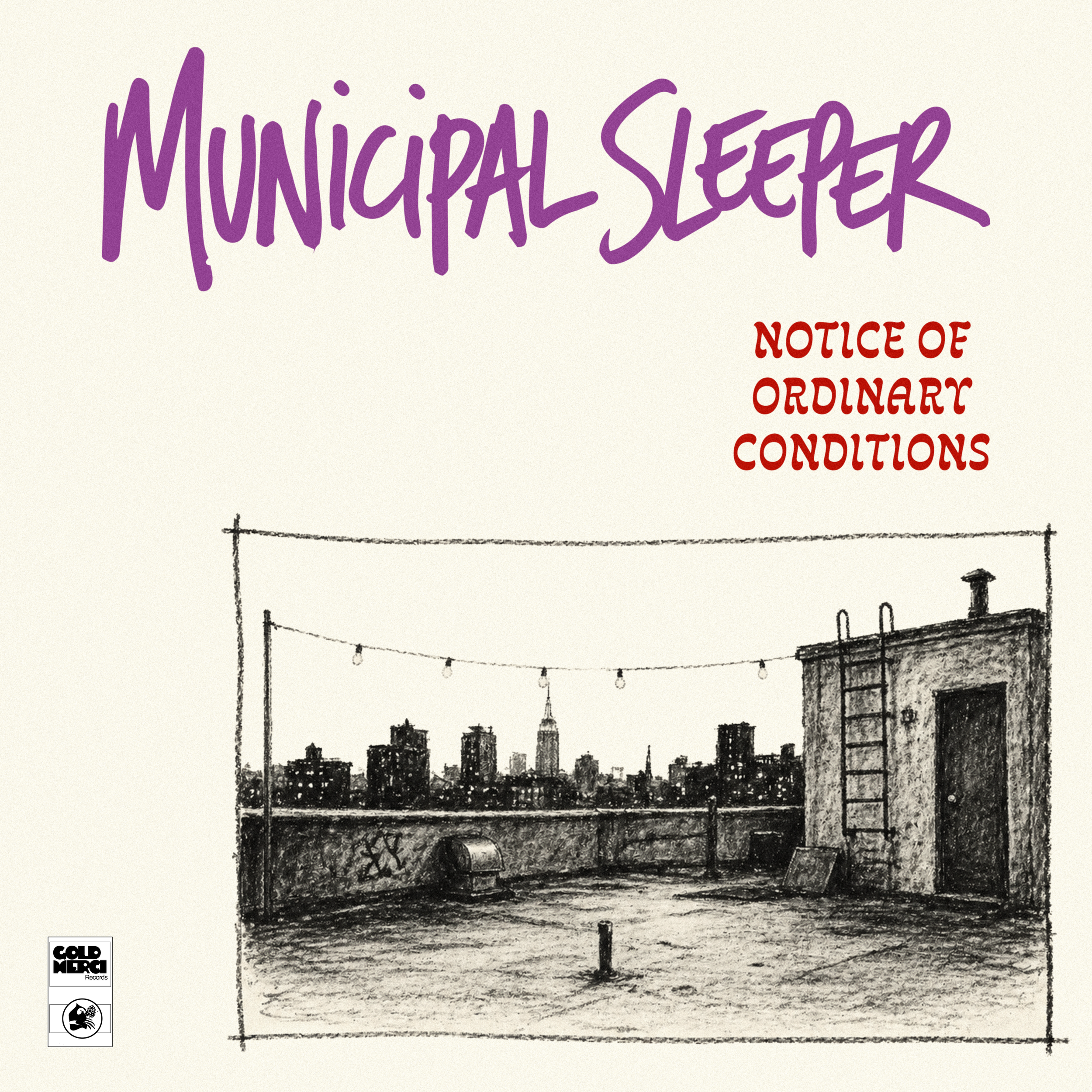
Municipal Sleeper — Municipal Sleeper
Brief
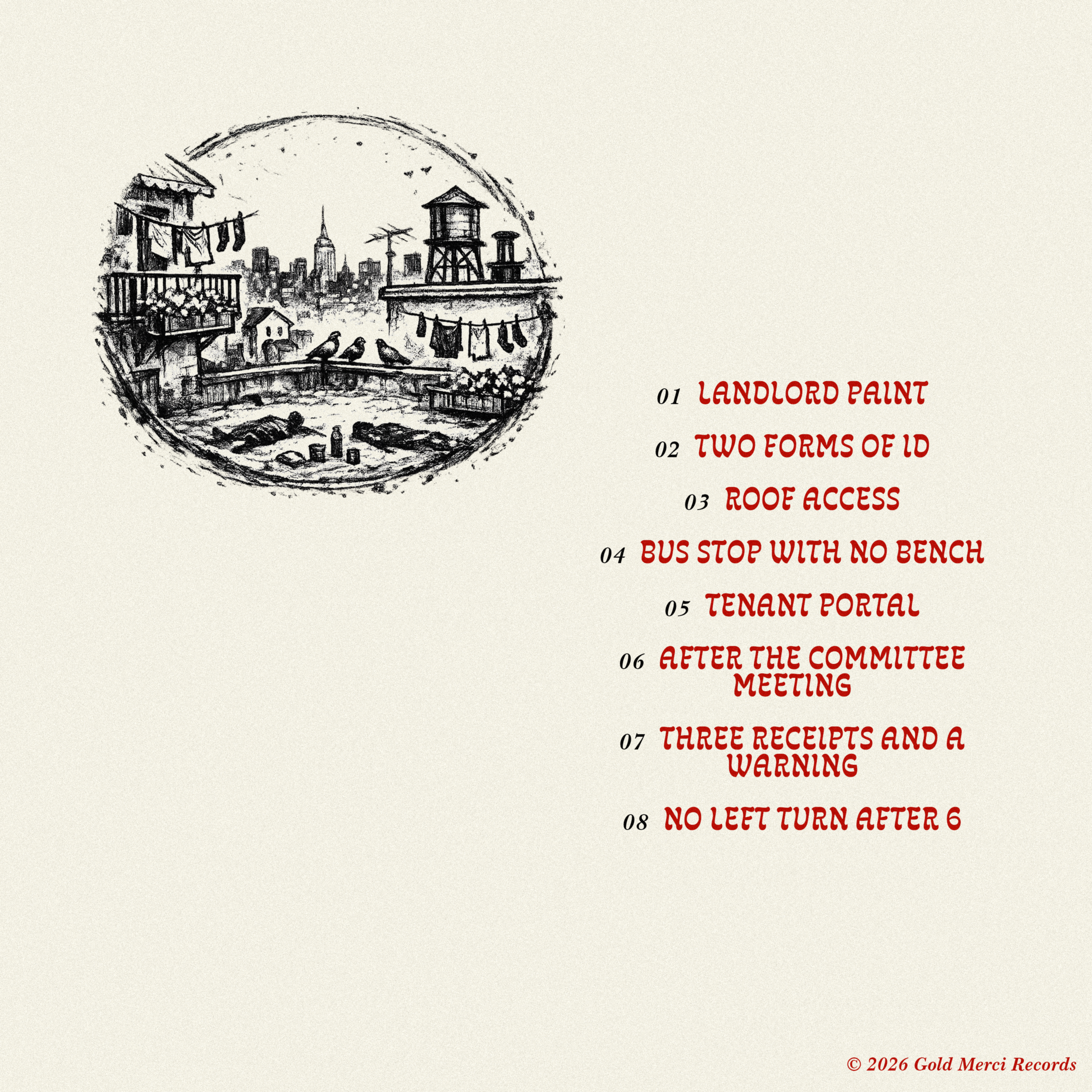
Municipal Sleeper needed a stark, hand-drawn album world for an art-punk record: dry, urban, bored, funny, and slightly irritated. The cover needed to feel handmade but considered, using rough charcoal texture, Xerox grain, awkward negative space, and crude-but-intentional lettering.
Direction
The rooftop became the band portrait. Instead of showing the members, the cover showed the evidence of them: a roof-access door, ladder, string lights, vents, scuffed tar paper, a cheap ashtray, a half-folded chair, and a distant city skyline. The space felt recently occupied but abandoned, social without people, punk without fake collage.
Deliverables
Album cover direction, back cover concept, hand-drawn logo/type direction, Xerox texture system, tracklist layout direction, social crop guidance, and visual rules for future flyers and release assets.
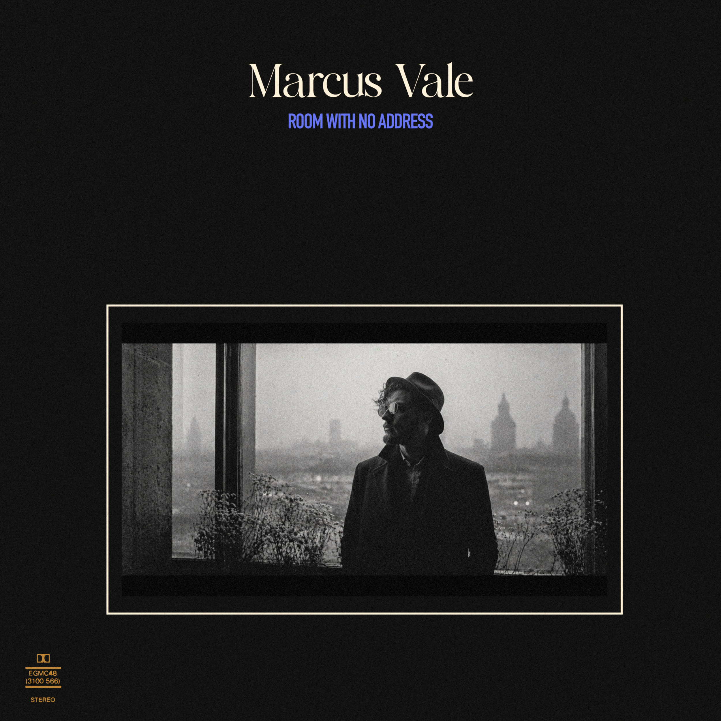
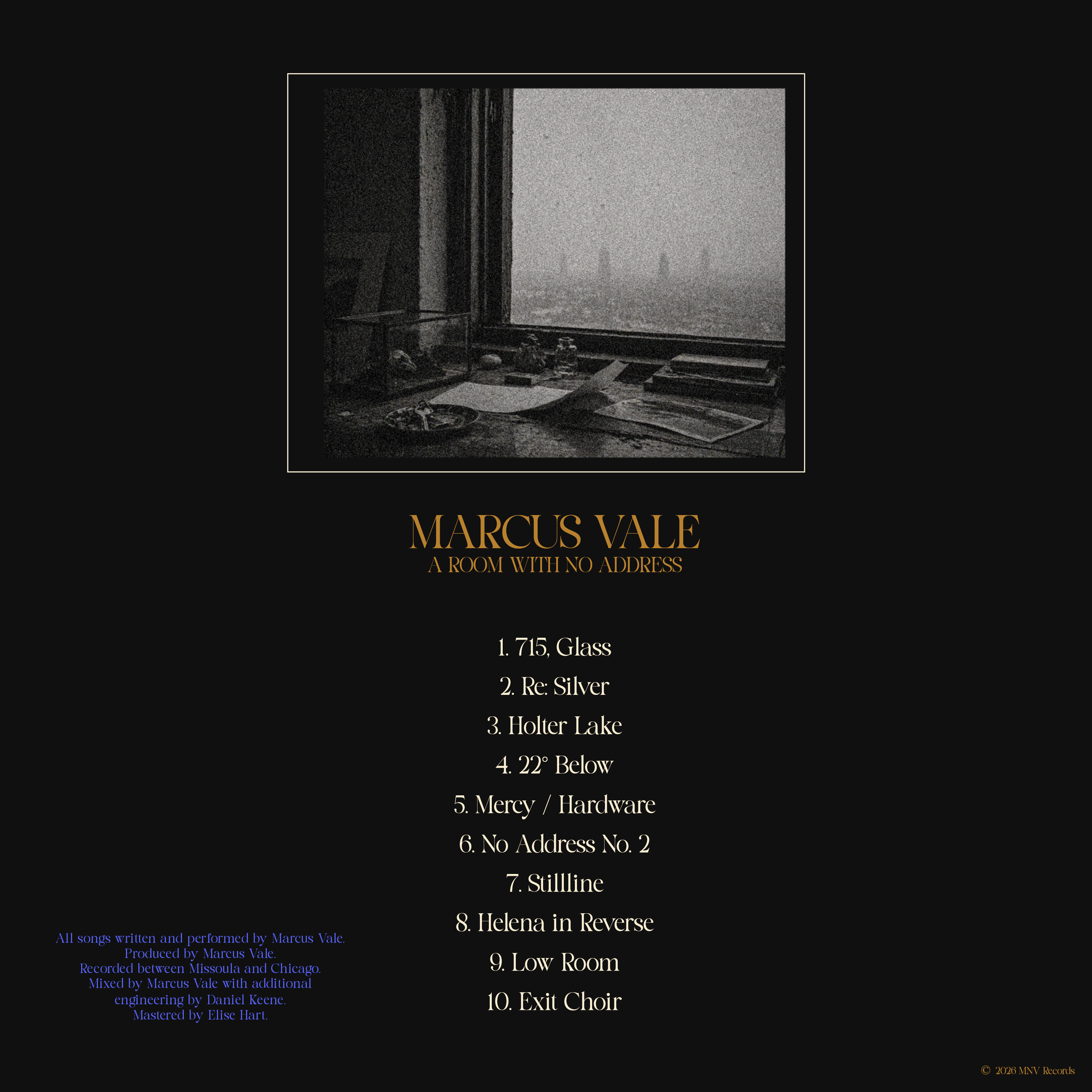

Marcus Vale — A Room With No Address
Brief
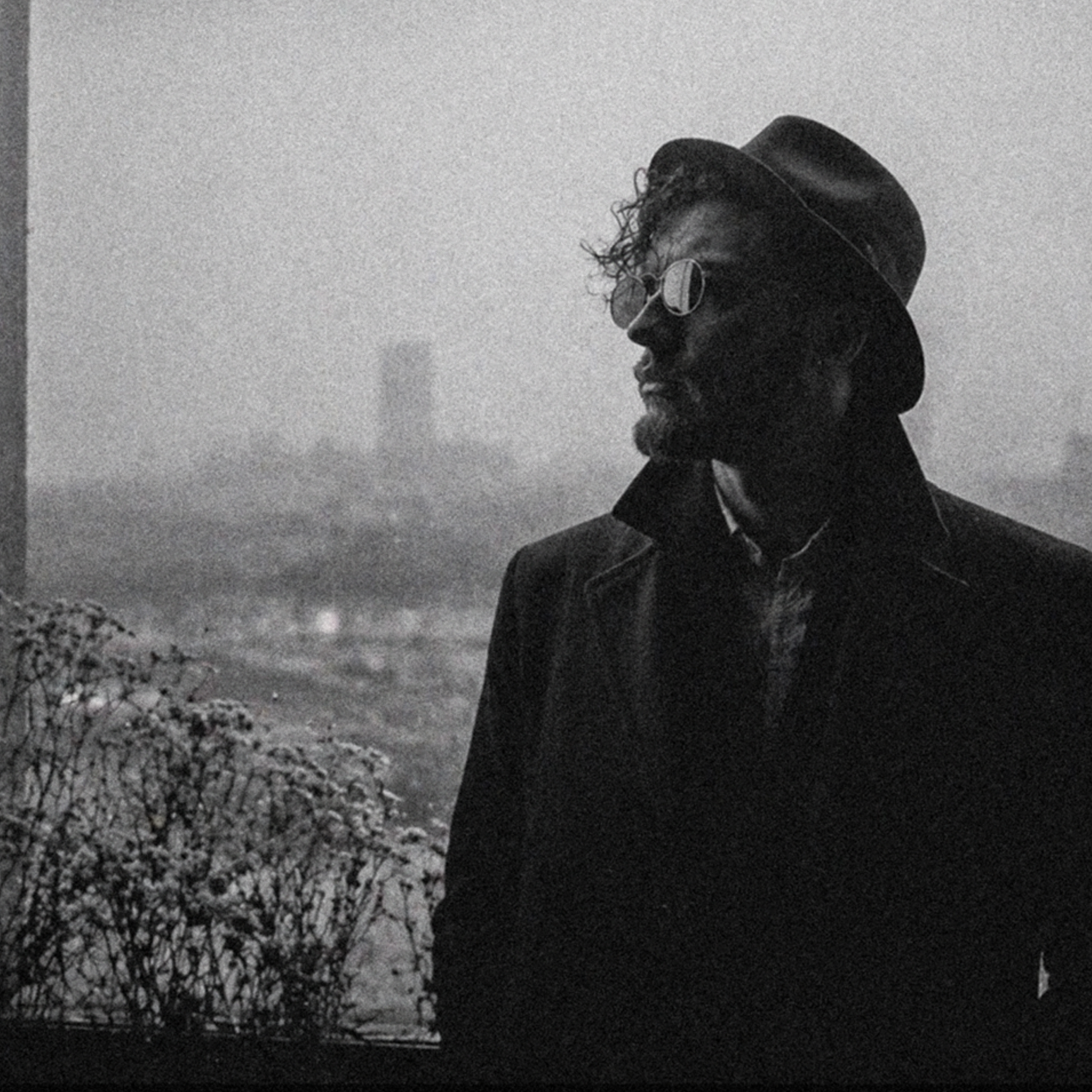
Marcus Vale needed a visual world for his first true solo statement after years as a touring guitarist and producer. The music was polished alternative rock with art-rock restraint: clean guitar hooks, post-punk rhythm, dry baritone vocals, and quiet ambition. The goal was to present him as a controlled, adult, visually literate frontman without leaning on rock cliché or Montana imagery.
Direction
The cover treated Marcus as a figure inside architecture rather than a posed rock artist. A wide black-and-white portrait sits low on a deep black field, framed by a thin cream border with generous negative space above. Fog, glass, windows, and a distant skyline create distance and pressure. Large serif typography gives the artist name classic weight, while the smaller condensed blue album title adds a sharper contemporary note.
Deliverables
Album cover direction, artist-positioning language, typography direction, black/cream/blue palette, portrait treatment notes, back-cover layout system, technical mark concept, press-photo direction, social crop guidance, and visual rules for future rollout assets.