SERVICES
Services
About Clear Noise
Clear Noise is a creative direction practice for independent artists.
What Clear Noise Does
Clear Noise helps artists turn scattered good ideas into a coherent world around the music. The work shows up as cover art, promo systems, written direction, release-world briefs, and occasional custom projects that need a sharper visual or conceptual frame.
Clear Noise also publishes The Clear Noise Standard and sells templates, beat packs, and practical tools for independent artists and producers.
How Clear Noise Works
Async first. Most projects close without a single call.
Fixed prices. The numbers on the Studio page are the numbers.
Two revision rounds.
Final files ready to ship.
A limited project calendar, by design.
Background
Clear Noise brings together graphic design, music production, writing, release strategy, and independent artist development.
Production and engineering credits include:
Fortress Nino, Wave Report and Gold Subwoofer
Kool A.D., “Freedom” and “Curse Reversin”
Shirt, “The Drama of Being Alive”
The work is handled directly through the Clear Noise process, from first read to final files.
Why
Independent artists deserve the same level of visual and conceptual care that label artists get, without the gatekeeping or inflated agency process.
The work is built to ship. To support the release. To make the song feel placed inside a world that fits.
Not to win awards. Not to fill an agency reel.
Press and Other Inquiries
WORK
What the Artist Asked For
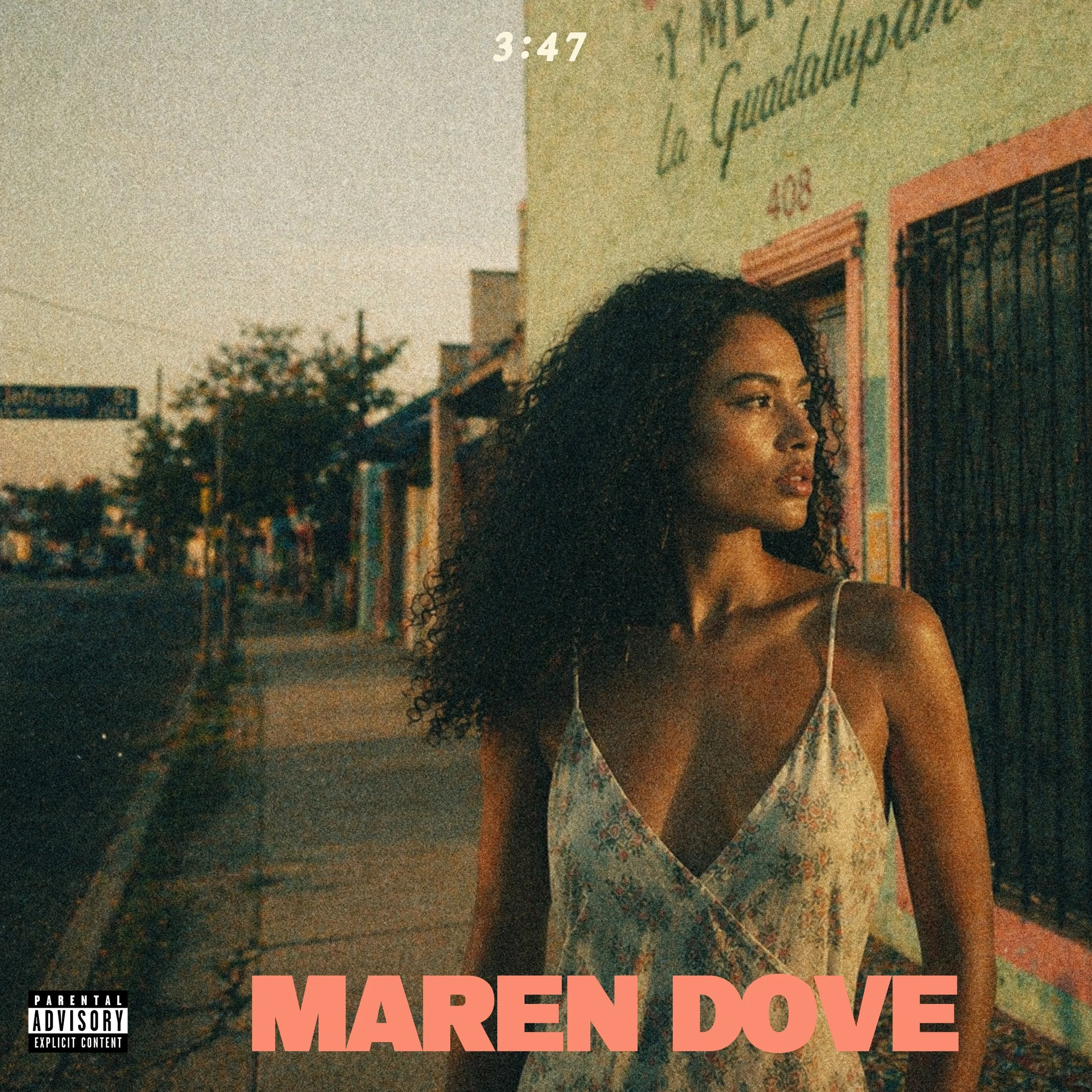
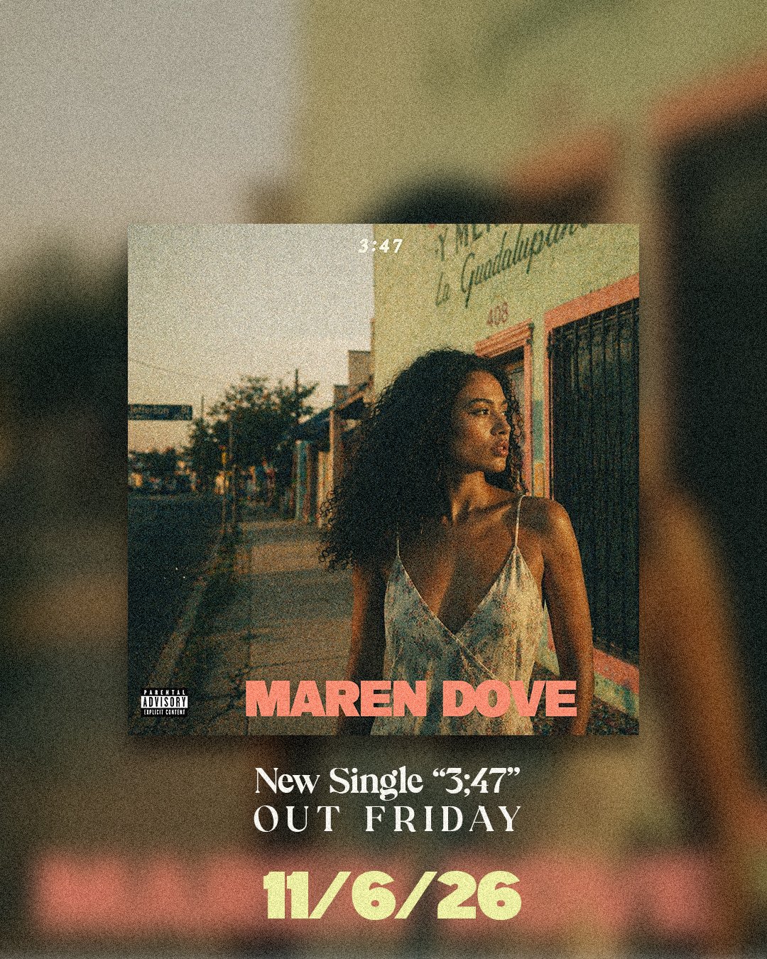
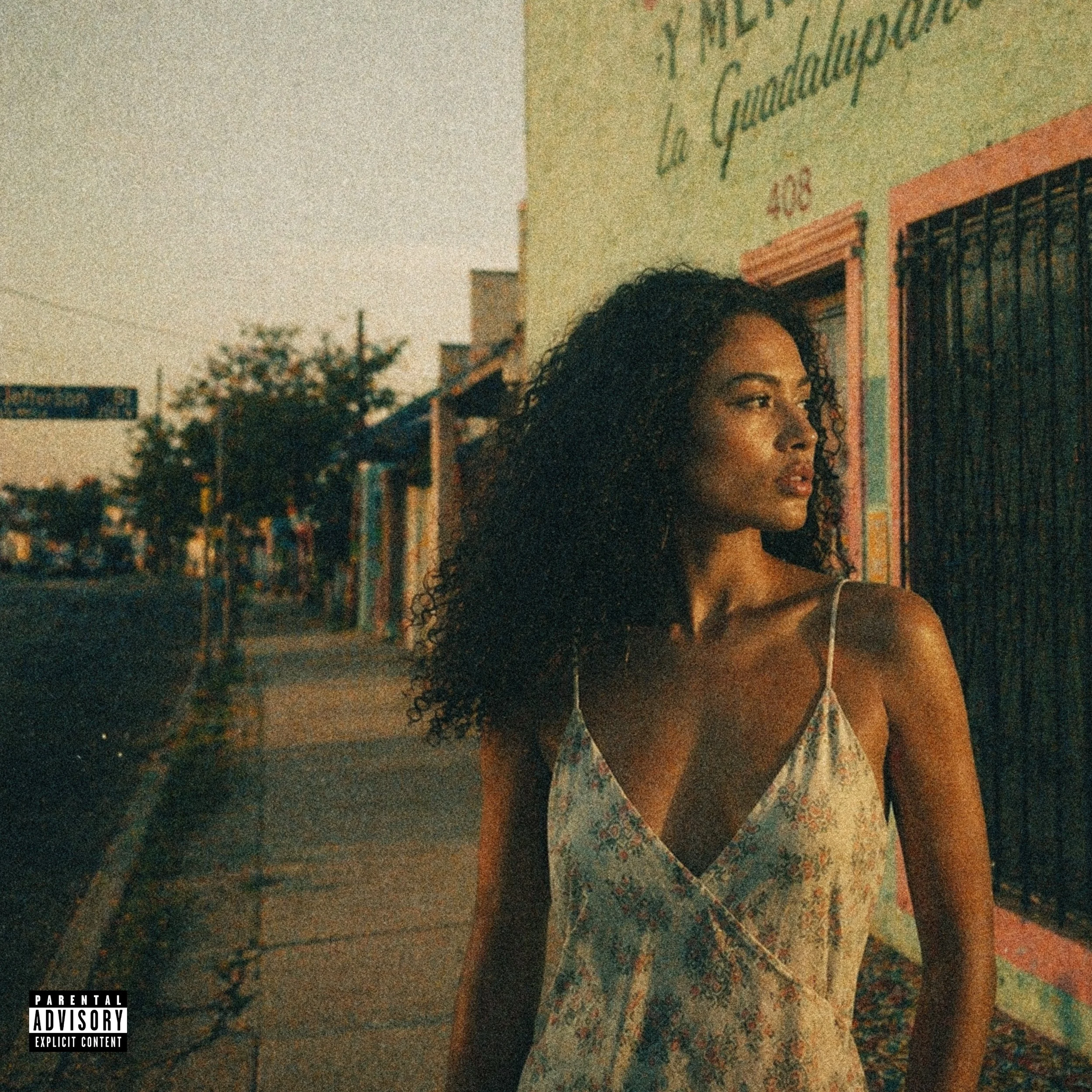
Maren Dove is a 24-year-old Oak Cliff artist releasing her debut single, “3:47,” on November 16, 2026. The brief frames her as a local, family-rooted songwriter shaped by church organ, Jefferson Blvd, the Kessler area, Baptist choir music, and bedroom songwriting.
The sound is slow Oak Cliff soul: smoky vocals, live church organ, chopped drums, hovering bass, horns, and screwed-down Texas pacing. The song’s personal thread is subtle, based on a story of a chance encounter one afternoon in the Bishop Arts District.
Visually, the requested world was Oak Cliff at golden hour: stucco, chain-link, Texas Theatre, Lake Cliff Park, corner-store dusk, purple-amber light, film grain, and warm imperfection. A Polaroid of her grandmother’s gold bracelet barely in frame. The references pointed toward restrained, atmospheric, local, memory-heavy visuals rather than anything too clean or busy. Vintage-leaning, but not nostalgic for nostalgia’s sake.
Bonus: tie the visuals to lyrical content where possible.
What the Artist Asked for:
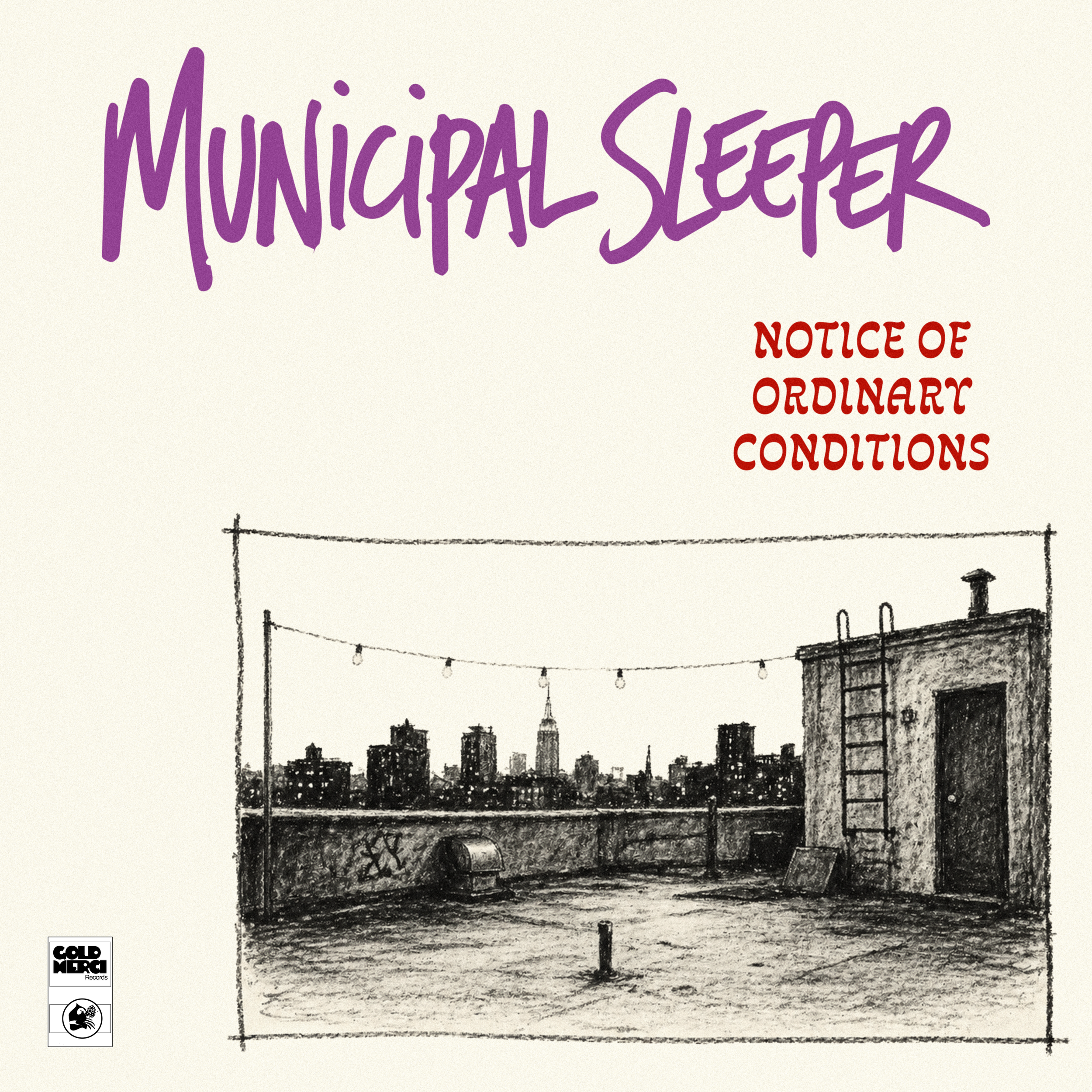
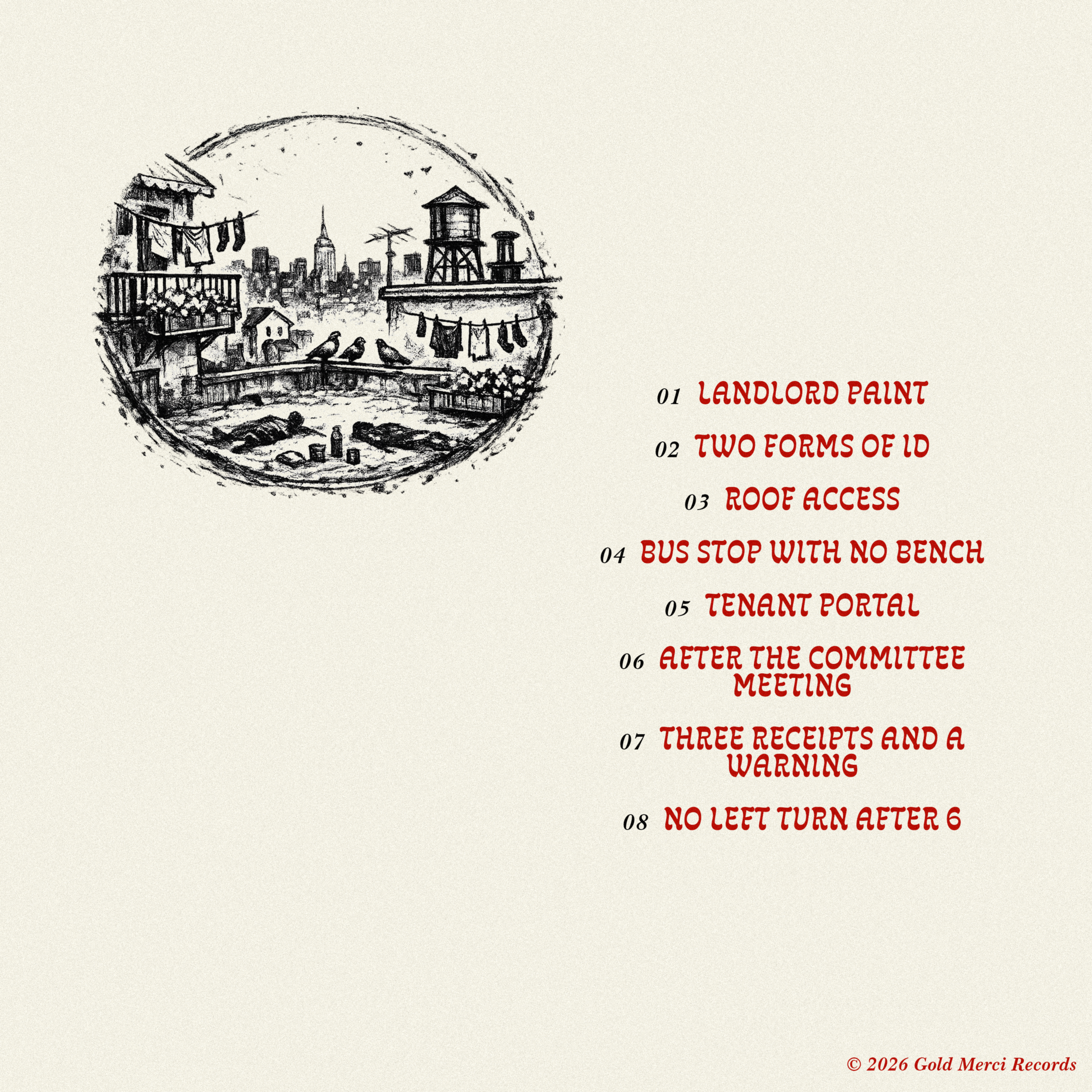
Municipal Sleeper wanted a stark, hand-drawn album world for a Parquet Courts-adjacent art-punk band: dry, urban, bored, funny, and slightly irritated. The cover needed to feel handmade but considered, using rough charcoal/pencil texture, Xerox grain, awkward negative space, and crude-but-intentional lettering.
They wanted the main image to be an empty rooftop scene, not a band photo: roof-access door, ladder, string lights, vents, scuffed tar paper, and a distant city skyline. The space should feel recently occupied but abandoned, like the band had just left. No people, no obvious clichés for the genre, no gritty alley tropes, no fake punk collage, and no overdesigned polish.

What the Artist Asked For:
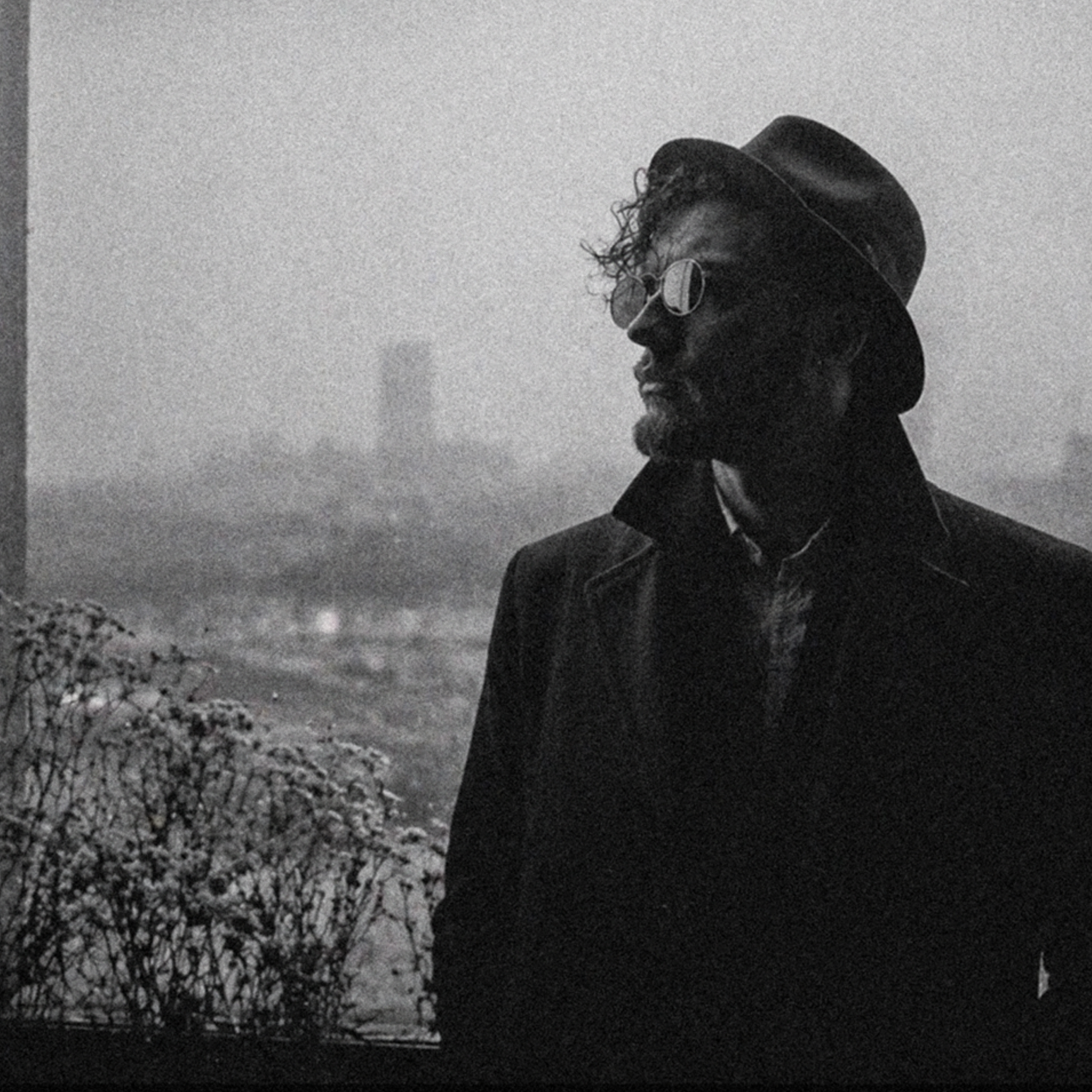
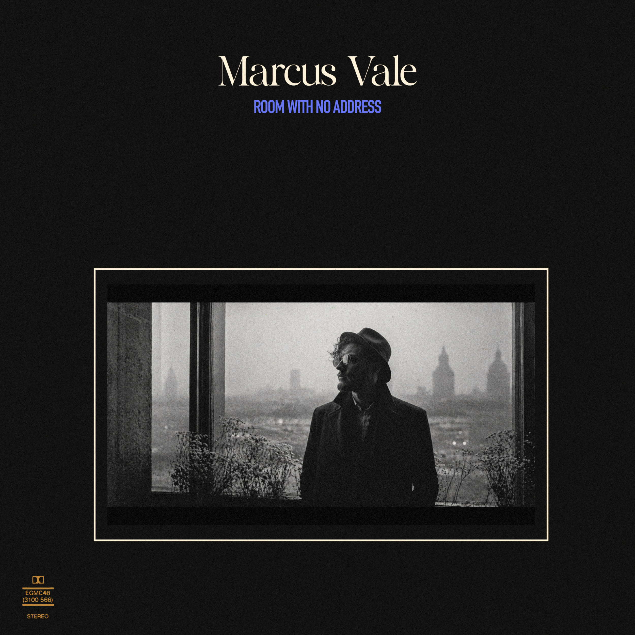
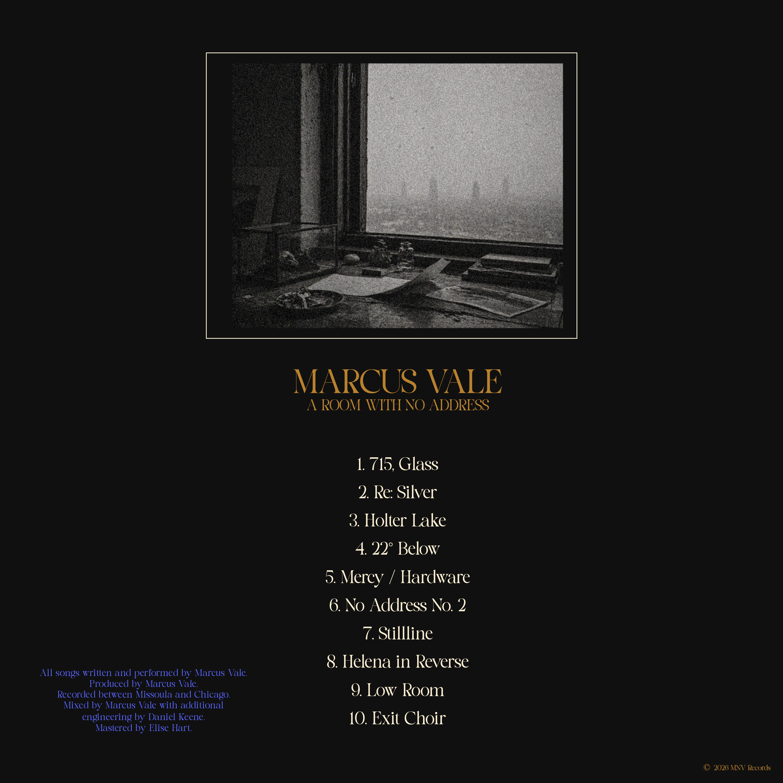
Marcus Vale is a 33-year-old solo artist from Missoula, Montana making polished alternative rock with art-rock restraint, post-punk rhythm, clean guitar hooks, and a dry baritone vocal style. After years working as a touring guitarist and behind-the-scenes producer, A Room With No Address presents him as a fully formed frontman: controlled, adult, visually literate, and serious without feeling theatrical. The project is built around taste, restraint, and quiet ambition rather than local-scene grit or rock cliché.
The cover uses a restrained, gallery-like layout: a wide black-and-white portrait sits low on a deep black field, framed by a thin cream border with generous negative space above. The image feels cinematic and controlled, with Marcus placed inside a windowed architectural scene rather than posed like a traditional rock artist. The fog, glass, and distant skyline give the record a sense of distance and pressure without relying on obvious Montana imagery or genre clichés.
The typography gives the project a more elevated, design-conscious identity. The large serif artist name feels adult and classic, while the smaller condensed blue album title adds a sharper contemporary note. The small technical mark in the lower-left corner makes the sleeve feel like a found archival object or private-label pressing. Overall, the design positions Marcus as a serious solo artist with a complete visual world: polished, quiet, adult, and slightly severe without feeling cold or inaccessible.